· The woods
Birch, teak or walnut
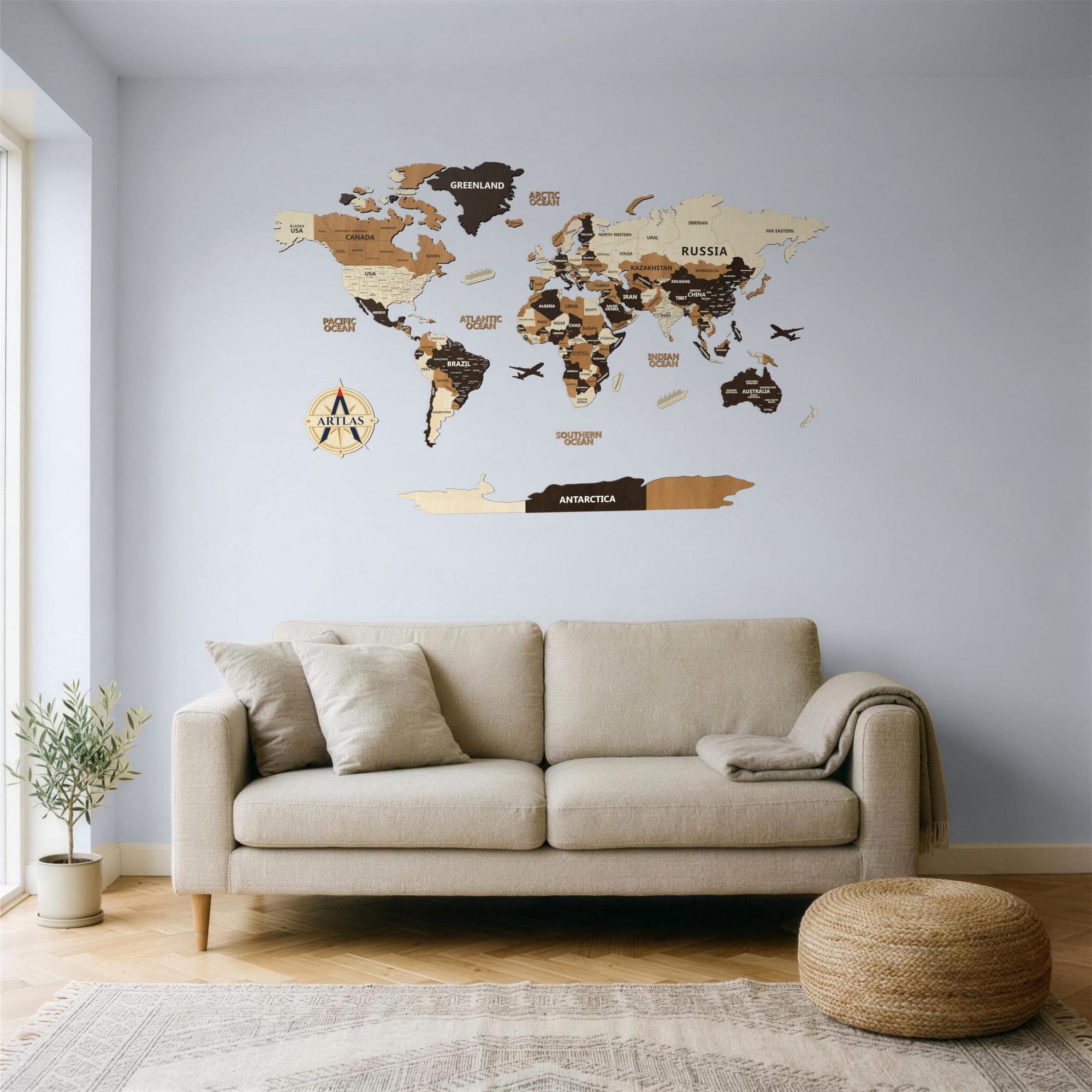
One map, four finishes. What changes is the wood — and the wall each one suits.
One map, four finishes. Every one is cut to order and made the same way — what changes is the wood.
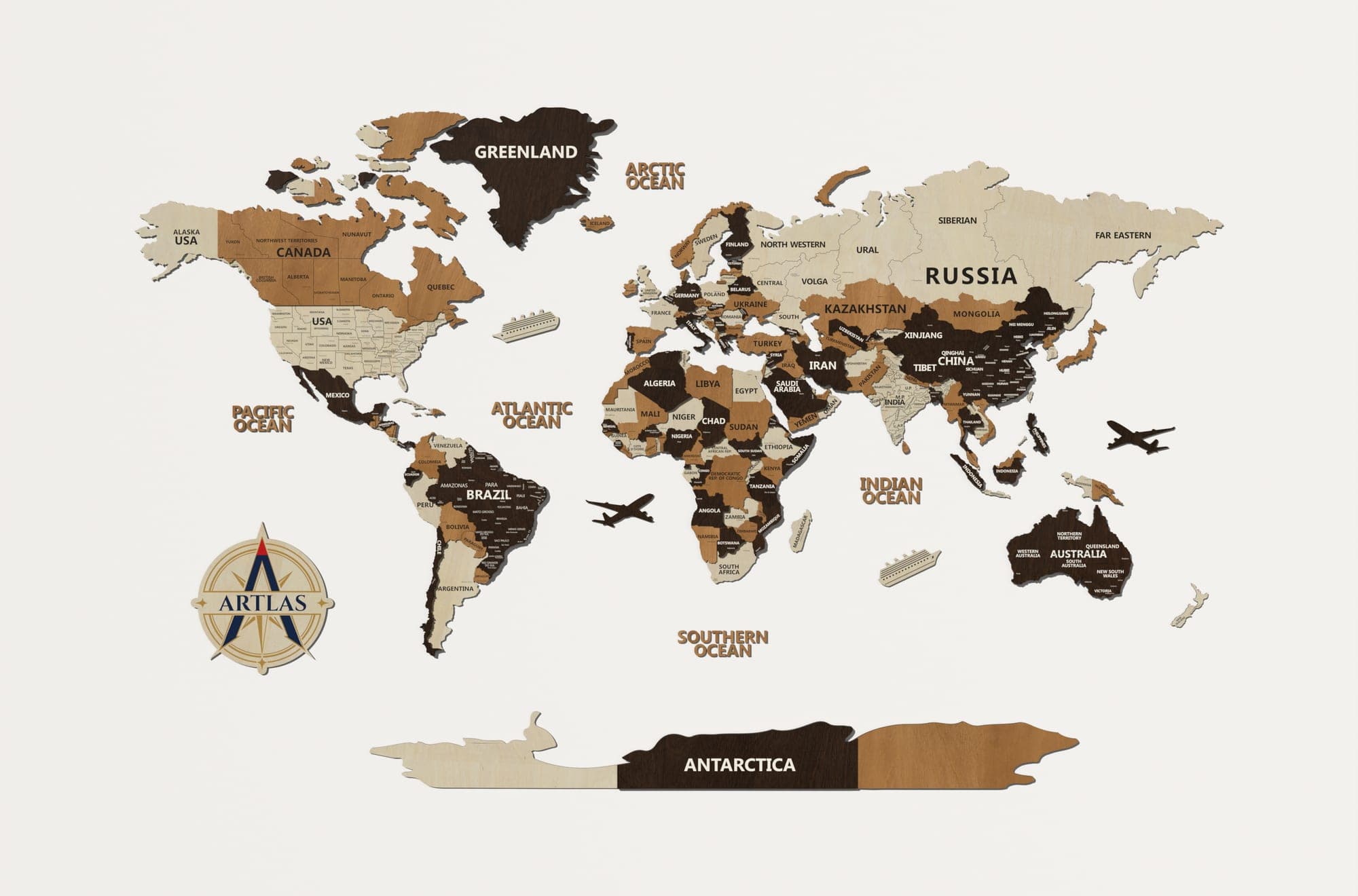
Multicolour
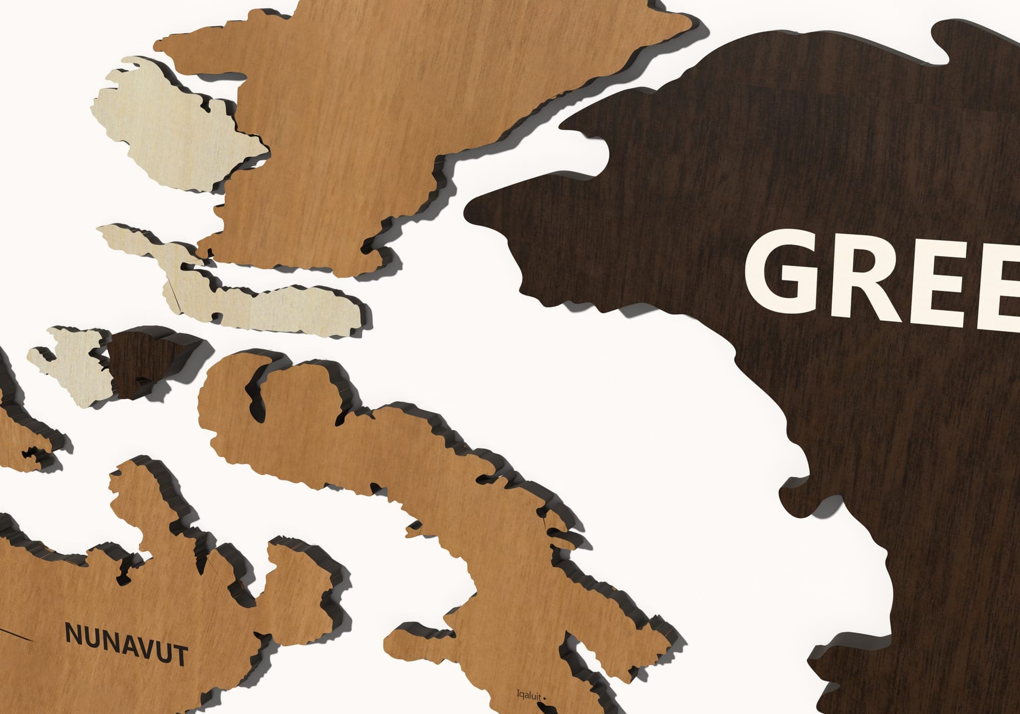
Birch, teak and walnut together. The standard palette. Three wood tones, one at each depth: birch at 4 mm, teak at 8 mm, walnut at 12 mm. Neighbouring countries never share the same tone or the same depth — that is what separates them by eye, rather than a printed line.
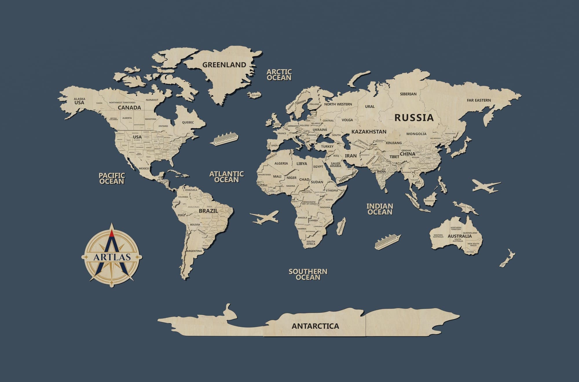
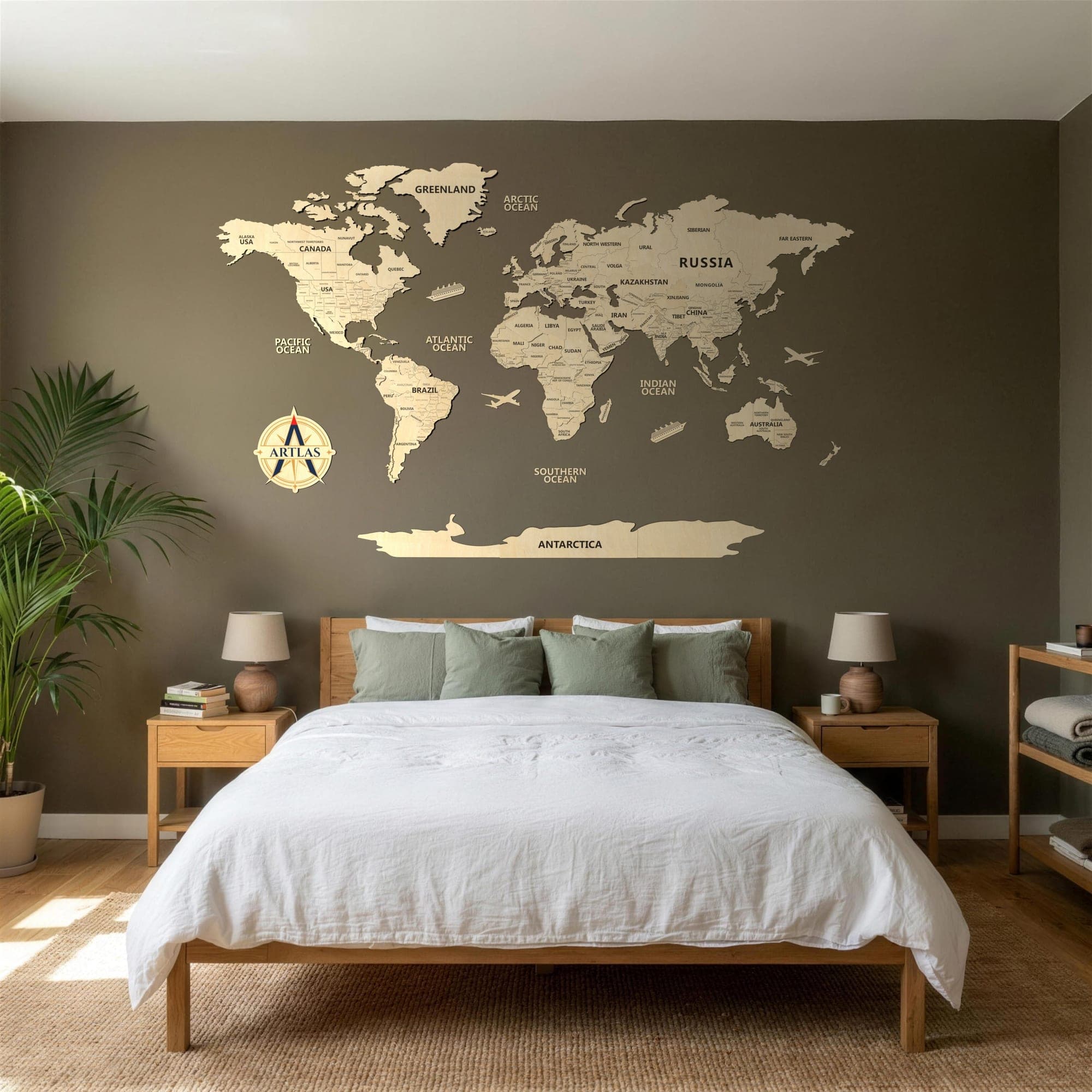
Birch
Which wall it suits. Birch carries best on a dark or a saturated wall — charcoal, forest, deep blue, terracotta — where the pale silhouette separates cleanly. On white or cream it reads as a soft, tonal relief; beautiful in raking light, quiet in flat light.
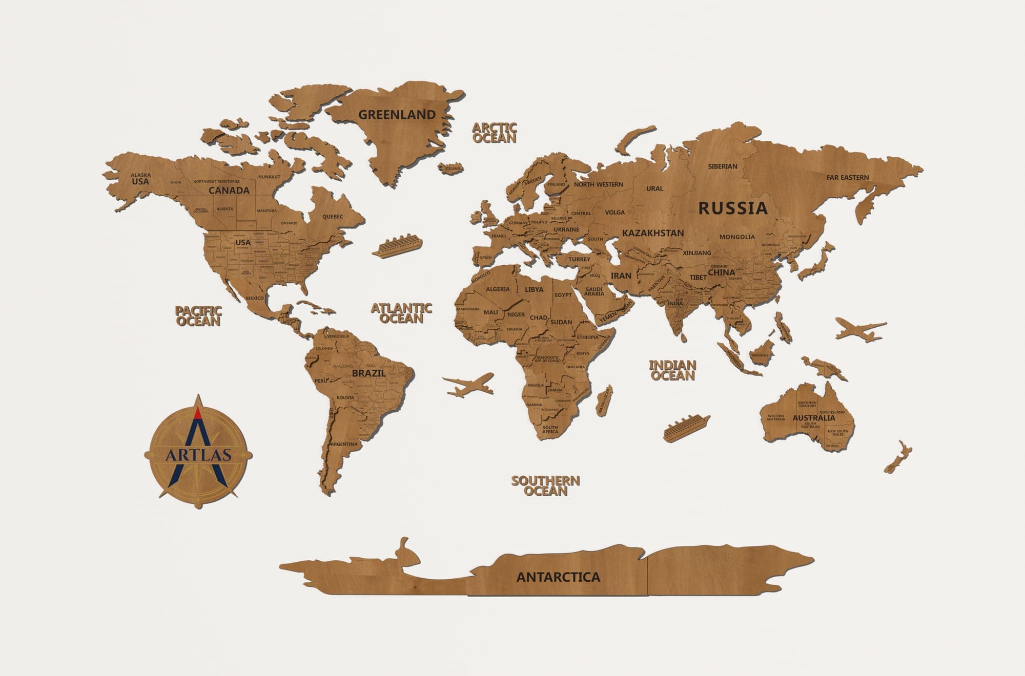
Teak
Which wall it suits. Teak is the safest of the three. It sits warm against white, cream and stone; it stays legible against charcoal and deep green; and it is the one that reads as furniture rather than as artwork, so it settles easily into a room that already has wood in it.
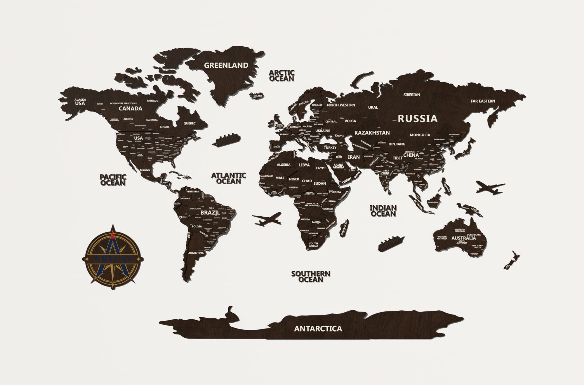
Walnut
Which wall it suits. Walnut needs a light wall to work — white, ivory, pale grey, sand. Against those it is the sharpest silhouette of the four maps. On a dark wall it disappears into the paint, so if your wall is charcoal or deep green, choose birch or teak instead.
What does not change
Same cartography, same cutting, same depths, same build. On a single-tone map, countries are separated by depth and shadow rather than by tone. Birch, teak and walnut are real woods, so grain and tone vary sheet to sheet. Every edge is finished by hand after cutting.
More from the blog